Understanding Gross Domestic Product (GDP) Composition
Gross domestic product, or GDP, is often described as the single number that defines the health of an economy. It captures the total value of goods and services produced, including what consumers buy, what businesses invest, what governments spend, and the bal

Gross domestic product, or GDP, is often described as the single number that defines the health of an economy. It captures the total value of goods and services produced, including what consumers buy, what businesses invest, what governments spend, and the balance of trade. At first glance, GDP seems like a straightforward measure of growth, but the number itself can be misleading if you don’t look beneath the surface. Some categories carry far more weight in explaining the economy’s direction, while others create temporary noise. Knowing how to separate those signals from the distractions is the key to extracting the real value from GDP reports.
The GDP Breakdown
- Consumption: This is household spending on goods and services, from groceries to rent to doctor visits. It usually makes up the largest share of GDP, which means changes in consumer behavior are often the most reliable signal of how the economy is doing.
- Investment: Businesses invest in things like new factories, software, or equipment, and households invest in housing. Investment is smaller than consumption but highly influential, because it can indicate whether businesses are confident about future growth.
- Government Spending: This includes spending on defense, education, infrastructure, and other public services. While it can temporarily boost GDP, it doesn’t always reflect the underlying strength of the private economy.
- Net Exports: Exports add to GDP, while imports subtract from it. Because trade flows can swing sharply with exchange rates or temporary supply chain issues, this category often creates noise in the data rather than a clear signal.
Below, we’re going to look at how each of these categories shows up in the data and why some matter far more than others. We’ll walk through how to separate signal from noise, explore a cleaner measure economists use called Real Final Sales to Private Domestic Purchasers, and then examine real-world examples where the headline GDP number sent the wrong message. By the end, you’ll have a simple toolkit for reading GDP reports like an economist and spotting what really drives growth.
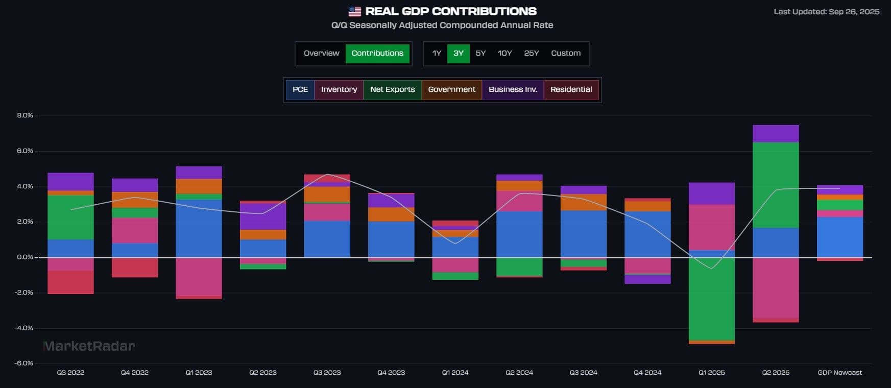
The chart above shows each of the four main GDP categories broken into their subcomponents. This detail helps reveal which parts carry real economic weight and which can distort the picture:
Consumption = Personal Consumption Expenditures (PCE): The largest and most stable driver of GDP, reflecting household spending on goods and services.
Investment = Business Investment, Residential Investment, Inventories:
- Business investment shows how confident firms are about the future.
- Residential investment reflects housing activity, which rises and falls with interest rates.
- Inventories can swing the headline number quarter to quarter, but rarely tell us much about lasting demand.
Government spending = Government outlays: Steady support, though less informative about the private economy.
Net exports = Exports minus imports: This line can make growth look stronger or weaker depending on trade flows, even if domestic demand is unchanged.
Breaking GDP into its parts is the first step, but the real insight comes from seeing how the flows between categories interact. Growth in one area can signal strength, but if it is offset by weakness elsewhere, the headline number may hide what is actually happening beneath the surface.
For example, if consumer spending is rising but business investment is falling, households may be propping up growth in the short term while businesses pull back on the future. Similarly, a spike in government spending can lift GDP temporarily, but it may not reflect lasting private-sector momentum. Even trade flows can distort the picture: an import slowdown can make GDP look stronger, but it might actually point to weaker consumer demand.
The key is to connect these flows and spot the real trends, asking not just how much GDP is growing, but where the growth is coming from. Sustainable expansions tend to be led by strong consumption and healthy investment, while growth driven mainly by inventories, government outlays, or temporary trade shifts often carries less lasting power.
Spotting the Real Trends
Economists often strip away the noisiest parts of GDP to get a clearer picture of underlying demand. One of the most useful measures is Real Final Sales to Private Domestic Purchasers. It focuses only on household consumption and private investment, leaving out inventories, government spending, and trade flows. In other words, it captures the spending that best reflects the private economy’s strength.
This measure tends to track the economy’s true momentum more closely than the headline GDP number. For example, GDP can look strong in a quarter because businesses are piling up unsold goods or because imports temporarily fall, but Real Final Sales to Private Domestic Purchasers would show whether consumers and businesses are actually driving sustainable growth.
🚀 Join the Radar Community
Get free access to MacroBase and notifications about new posts and updates.
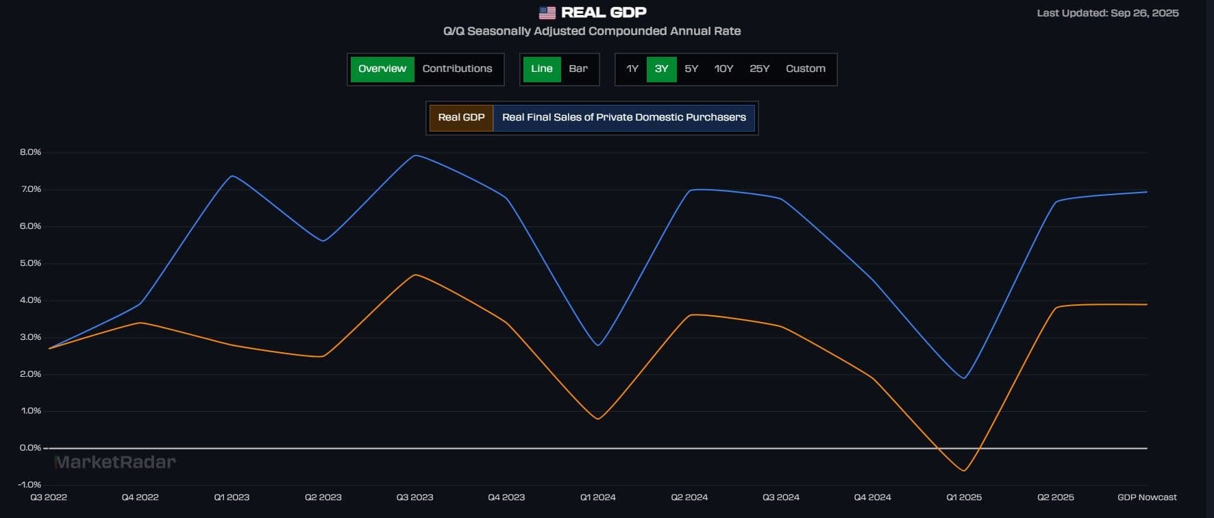
The orange line shows headline Real GDP, while the blue line tracks Real Final Sales to Private Domestic Purchasers, which removes inventories, government spending, and trade to highlight private demand. When the two measures diverge, the blue line offers the clearer signal.
- Blue below orange: Growth is being inflated by temporary factors like inventories or trade, meaning private demand is weaker than the headline suggests. This typically happens in a recession.
- Blue above orange: Private demand is stronger than the headline implies, showing underlying momentum even if GDP looks soft. This is the normal structure; private demand runs above headline in non-recessionary periods.
In short, GDP tells you how fast the economy is moving, while Real Final Sales tells you how strong the engine really is. Comparing the two side by side creates a powerful lens: when they move together, the signal is straightforward, but when they diverge, the gap itself becomes informative. Those dislocations can reveal whether headline growth is being propped up by temporary factors or whether private demand is stronger than the surface suggests.
Spotting the Divergences
By mapping Real GDP against Real Final Sales to Private Domestic Purchasers, we can isolate periods that look recessionary or alarming at first glance but actually tell a more nuanced story. Divergences help us cut through the noise, showing when apparent weakness masks resilient demand or when strong headlines rest on shaky foundations.
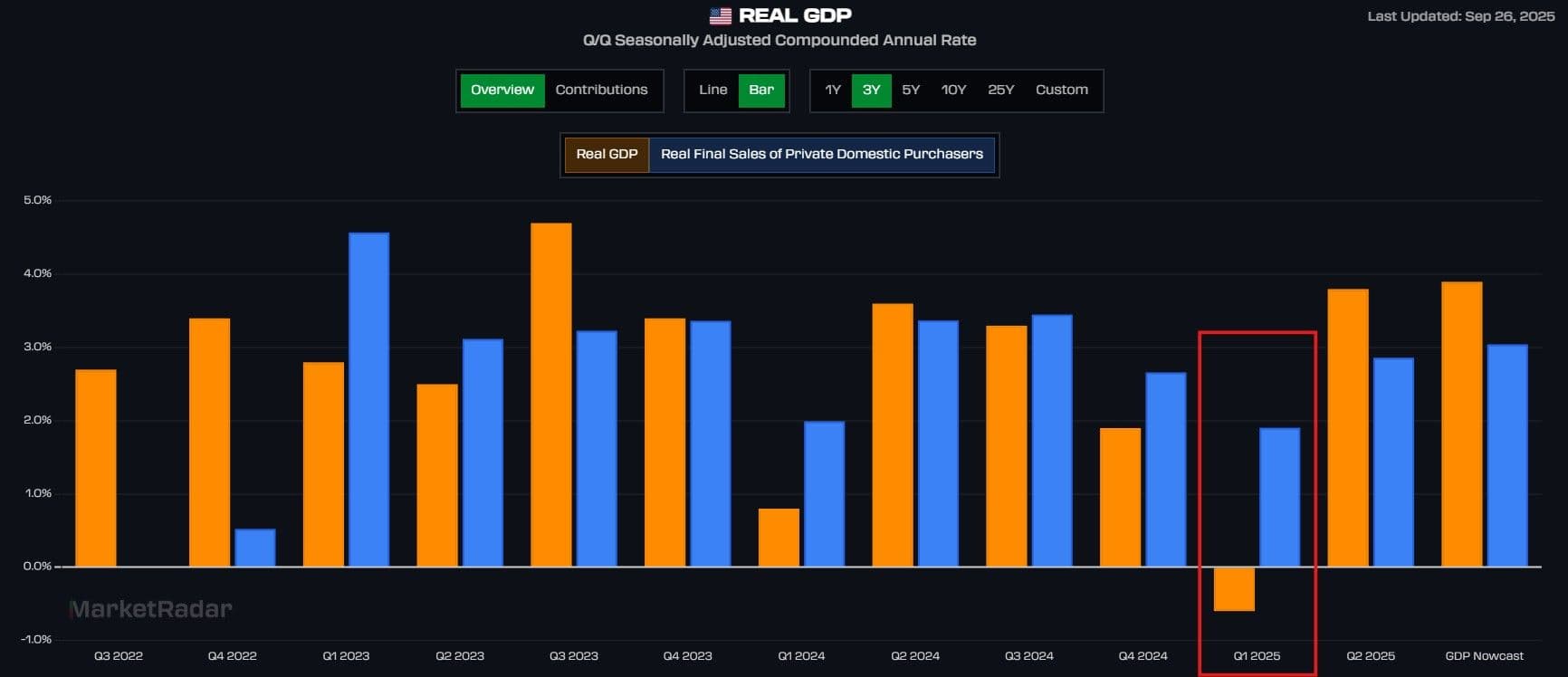
A clear example comes in the first quarter of 2025. Headline GDP (orange) slipped into negative territory, suggesting the economy was contracting. But Real Final Sales to Private Domestic Purchasers (blue) remained positive, showing that household consumption and private investment were still growing at a solid pace.
The gap came largely from a surge in imports, which subtract mechanically from GDP. More goods flowed into the country, so the trade balance weighed heavily on the headline number even though domestic demand was firm. If you looked only at GDP, Q1 2025 might have looked recessionary. By comparing it with Real Final Sales, however, the picture changes: the private economy was resilient, and the weakness was more about trade flows and tariff uncertainties than a real growth slowdown.
Going Even Deeper
Another way to look past the noise in GDP is by focusing on Real Nonfarm Output. This measure tracks the inflation-adjusted production of the private, nonfarm business sector, which makes up the bulk of the U.S. economy. By stripping out farms, government, and other volatile segments, it zeroes in on the part of the economy where most jobs, investment, and productivity gains are generated.
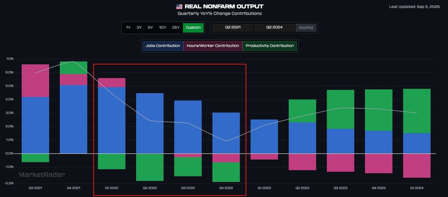
The chart above breaks Real Nonfarm Output into its three drivers: jobs (blue), hours worked per employee (pink), and productivity (green). This decomposition helps show not just whether output is growing, but how it is being supported.
Take the period from late 2021 into 2022. Overall GDP growth slowed noticeably, raising concerns about the strength of the expansion. Yet Real Nonfarm Output stayed positive, largely because payroll growth remained strong. Firms were still adding workers, which kept overall production rising even as productivity dipped and hours per worker softened. In other words, the private economy was being carried by labor market momentum, not efficiency gains.
This perspective makes Real Nonfarm Output a valuable confirmatory signal. It allows you to see whether the private economy’s growth is being driven by job creation, longer work hours, or productivity, and whether output is resilient even when headline GDP looks shaky.
Pulling the Signals Together
The 2021–2023 growth slowdown is the best case study for using GDP, Real Final Sales, and Real Nonfarm Output side by side. In the GDP chart, headline growth (orange) slipped into negative territory, fueling recession fears. At the same time, Real Final Sales (blue) dropped sharply, which rattled markets, but notice it never fell below zero. Because Real Final Sales captures household consumption and private investment, its resilience showed that private demand was still positive, even if growth was cooling.
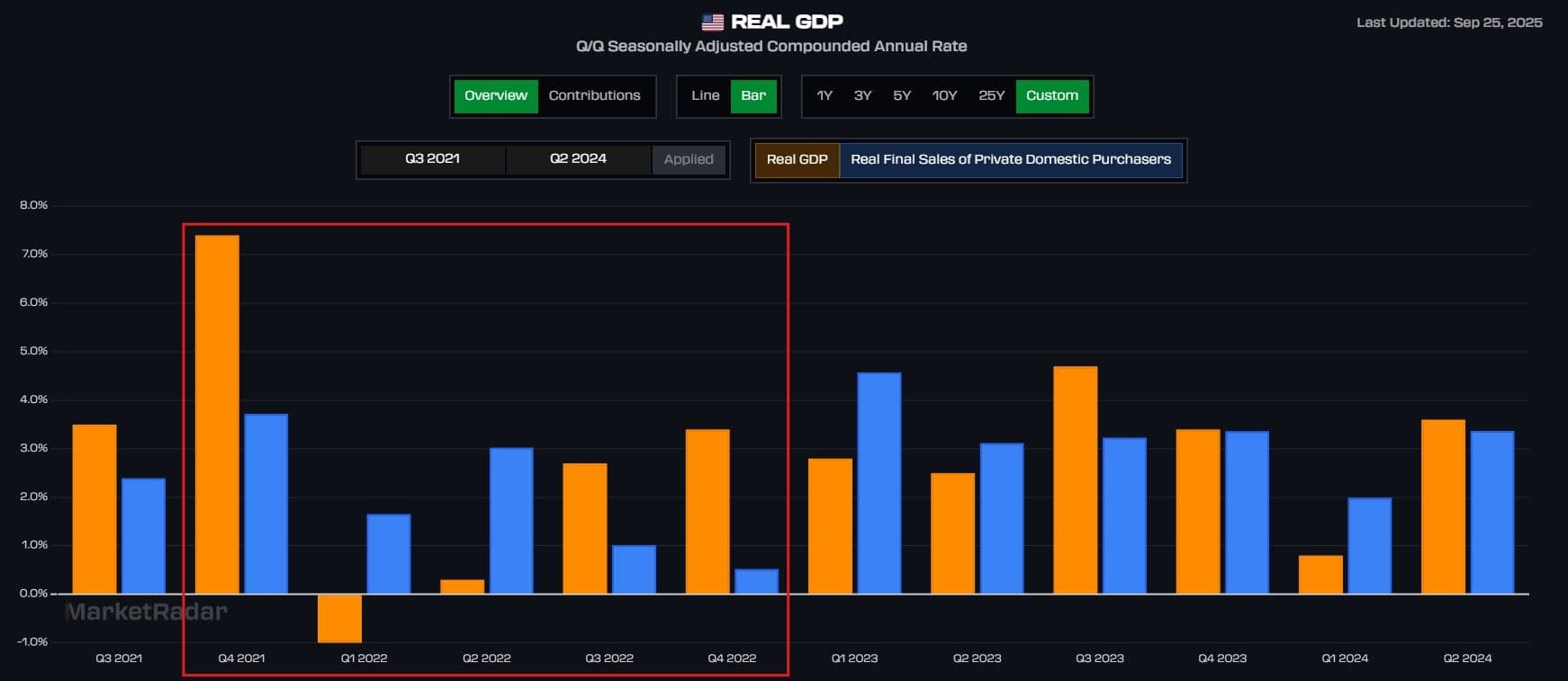
The picture becomes clearer when we bring in Real Nonfarm Output. In the output chart, growth also slowed, but it stayed positive throughout. Payroll gains were the main driver, keeping production afloat even as productivity softened. That labor momentum helped prevent both RFS and Nonfarm Output from going negative, two necessary conditions for a recession.
By layering the charts together, the story comes into focus. GDP gave the alarming headline, but Real Final Sales showed private demand never contracted, and Nonfarm Output confirmed that production held steady thanks to strong payroll growth. The economy was cooling off from its post-COVID surge, but it wasn’t regressing into a recession.
The takeaway: GDP tells you how fast the economy is moving, Real Final Sales shows how strong private demand is, and Nonfarm Output confirms whether production is backing it up. Looking at the three in sequence, as the charts above illustrate, is the best way to separate headline noise from true economic shifts.