Free Macro Tools: Neutral Rate Estimates
Every conversation about interest rates boils down to one question: what level keeps the economy steady, neither overheating nor stalling? Economists call this the “neutral rate,” written as r*. In theory, it’s the inflation-adjusted short-term rate consistent

Every conversation about interest rates boils down to one question: what level keeps the economy steady, neither overheating nor stalling? Economists call this the “neutral rate,” written as r*. In theory, it’s the inflation-adjusted short-term rate consistent with stable growth and inflation. In practice, though, r* is invisible. You can’t look it up on a Bloomie. Even central banks can only estimate it with wide uncertainty, and those estimates shift with every new data point.
Markets, however, live in nominal space. The Fed sets a nominal policy rate, investors price nominal yields, and positioning is expressed in basis points, not economic theory. That’s why we track our own internal neutral nominal rate. It’s not a replacement for r*; it’s a translation of the concept into the actual policy rate space where trades are made and risks are priced.
In this post, we’ll walk through how and why neutral rates matter, how we calculate our estimates, and what it reveals about where markets believe the Fed’s balance point really lies.
What Is Neutral?
Why does this abstract “neutral rate” matter so much? Because it’s the anchor point for monetary policy, the invisible line policymakers try to steer around. If the Fed sets interest rates above neutral, borrowing money becomes more expensive. Mortgages, car loans, and business credit all get pricier, which slows spending and investment. That cools growth and, if pushed too far, can tip the economy toward recession. If the Fed keeps rates below neutral, money stays cheap, demand runs hot, and inflation pressure builds. Every policy meeting, every bond repricing, every market narrative is, at its core, about where policy stands relative to this neutral line.
But neutral doesn’t just matter for households and businesses; it shapes the entire macro environment. When rates are above neutral, fiscal deficits often look worse because higher borrowing costs feed directly into the government’s debt service bill. If the Fed runs policy too tight for too long, growth slows, tax revenues shrink, and the deficit widens even further. On the flip side, when rates are below neutral and the economy is overheating, deficits can look smaller in the short run thanks to stronger revenues, but the risk is that inflation erodes the value of those gains and forces a painful tightening later.
Then there’s the output gap, the difference between what the economy could produce at full capacity and what it’s actually producing. If the Fed sets rates too high above neutral, demand falls below potential, factories slow down, workers get laid off, and the output gap turns negative. If rates sit below neutral, demand runs ahead of capacity, unemployment falls below sustainable levels, and inflation starts climbing, the output gap turns positive.
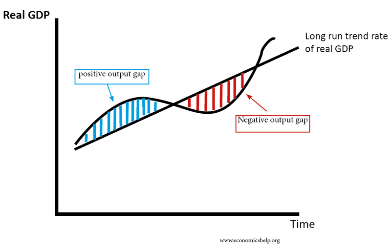
But here’s the nuance: being above or below neutral isn’t automatically a policy mistake. If the economy is in recession and the output gap is deeply negative, the Fed should hold rates below neutral to stimulate growth, even if that means running looser than “equilibrium.” Likewise, if fiscal deficits are large and the economy is overheating, the Fed may need to lean above neutral for a period to slow demand and stabilize prices. Neutral is the compass, but the Fed still has to steer through the terrain of output gaps, fiscal imbalances, and shocks.
This is why the neutral rate is the fulcrum for how monetary policy interacts with growth, inflation, and fiscal dynamics. Misjudge where neutral is, and you misread the entire stance of policy: whether the Fed is restraining the economy, juicing it, or simply letting it run steady.
What Does The Fed Use?
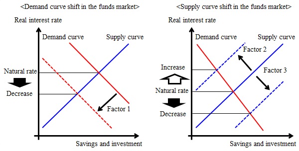
So if neutral is so important, how does the Fed figure it out? The short answer: they don’t know either, at least not with precision. Instead, they use estimates of r*, the real neutral rate. The New York Fed publishes one of the best-known versions. Their model tries to back out r* from economic data like GDP, inflation, and the Fed’s own policy rate. But here’s the catch: you can run the same model two ways (one-sided and two-sided) and get two very different versions of neutral:
One-sided estimate: what the model would have told policymakers in real time, using only data available up to that point. These are noisy and often revised later.
Two-sided (smoothed) estimate: what the model says looking back with the benefit of future data. This version looks much cleaner, but of course, the Fed doesn’t have it when decisions are actually being made.
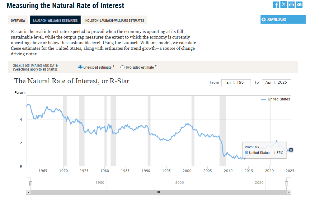
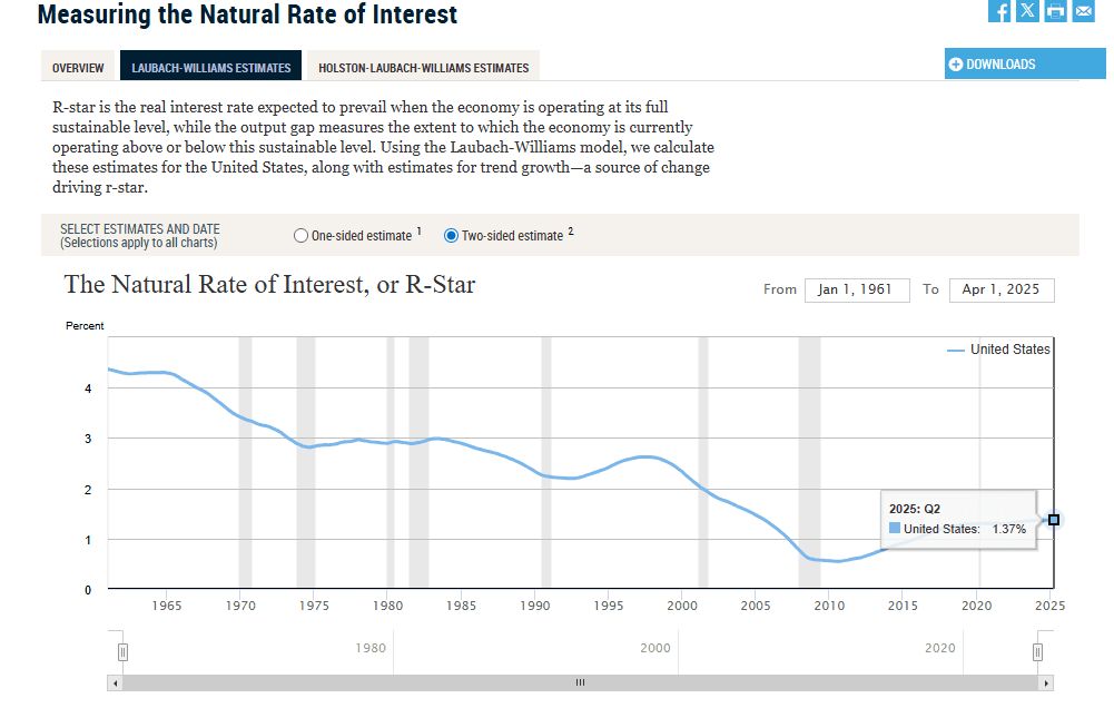
This creates a problem: even the Fed’s own researchers admit that r* is uncertain and model-dependent. Different models give different answers, and the estimates shift a lot over time. Policymakers themselves have said that r* can “differ substantially” across approaches and should only be treated as a rough compass, not a precise target.
🚀 Join the Radar Community
Get free access to MacroBase and notifications about new posts and updates.
That’s why the Fed also uses a second yardstick: the longer-run fed funds rate published in the Summary of Economic Projections (SEP). Unlike r*, this is a nominal neutral rate, the level each Fed official thinks policy converges to when the economy is steady and inflation is at 2%. It’s easier to communicate, but still just an approximation of neutral.
So at any given time, you don’t have one neutral rate, you have at least two: the real r* from academic models, with wide error bands, and the nominal longer-run rate from the SEP, which is more of a policy judgment. Neither is perfect, and both can move around depending on how the economy evolves.
The Market Radar Approach
If r* is the economist’s compass, our Market Radar neutral is the trader’s map. We wanted a way to take the idea of neutral out of theory and line it up directly against the 2-year benchmark, the part of the curve everyone watches as a proxy for central bank policy. That means building a neutral estimate that lives in the same “cash space” as the 2y benchmark.
Here’s how we do it:
We begin with the OIS rate, which is the market’s clearest indication of where overnight policy rates are expected to average over the observation period. Then we map the slope of the curve between 10y and 2y OIS, basically the market’s judgment about whether policy drifts higher or lower once you look past the near term. Finally, we adjust for the spread between the 2-year benchmark rate and the 2-year OIS. This last step translates our estimate into the cash market, so the number we produce can be compared point-for-point with the 2y benchmark.
The math is simple: 2y Neutral (cash-aligned) = (10y OIS – 2y OIS) + (2y benchmark – 2y OIS) + 2y OIS
Take a simple example:
- Our 2y neutral comes out at 3.8%.
- The 2y benchmark is trading at 3.6%.
That +20 bps gap means the market is pricing policy looser than neutral.
Flip it around: if the 2y benchmark is at 3.8%, the gap is –20 bps, policy looks more restrictive relative to neutral.
We only show the cash-aligned version of our neutral because that’s the rate traders actually see. OIS is a cleaner policy expectation tool, but it doesn’t capture the quirks of the cash market, repo specialness, issuance, and swap-spread shifts. By aligning our neutral to cash, those effects get baked in proportionally, which keeps the spread focused on stance rather than plumbing noise.
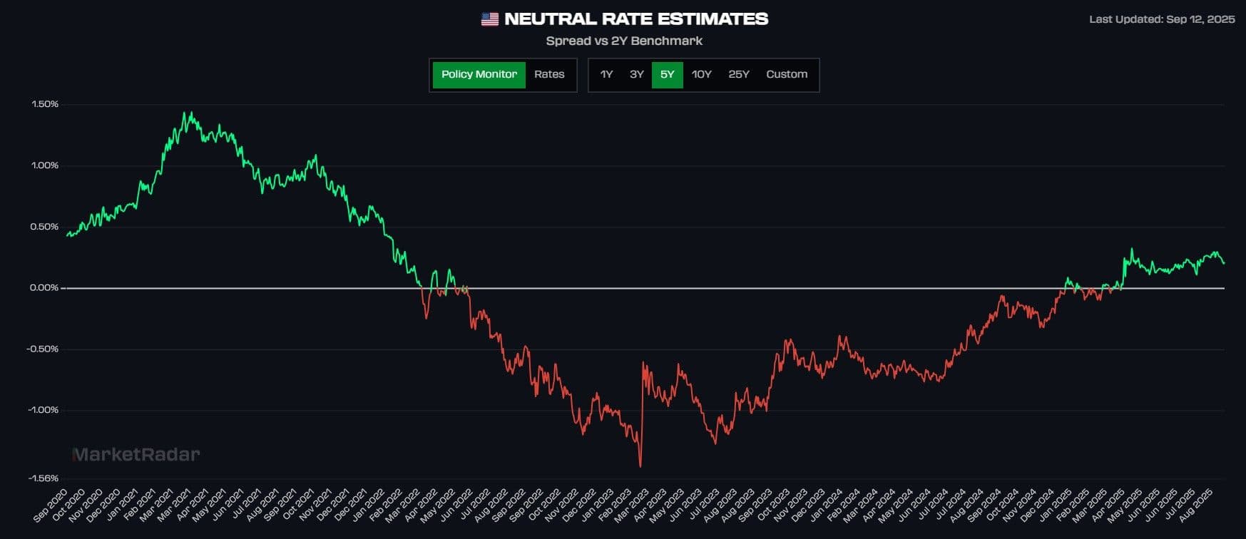
To make this concept practical, we plot our cash-aligned neutral rate against the 2-year benchmark and track the difference over time.
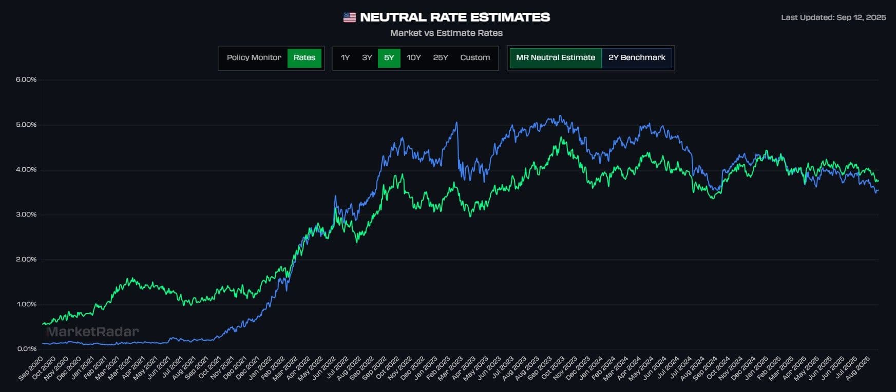
The interactive chart below shows the spread as (Neutral - 2Y Benchmark):
Green means the 2y benchmark is below our neutral estimate and the spread is positive. Policy is effectively loose, with markets pricing easier conditions than “just right.”
Red means the 2y benchmark is above our neutral estimate and the spread is negative. Policy is effectively restrictive, with markets pricing tighter conditions than the equilibrium.
This chart is updated real-time on our MacroBase dashboard. Our MacroBase dashboard is free, sign up for a basic account today and access this on demand!